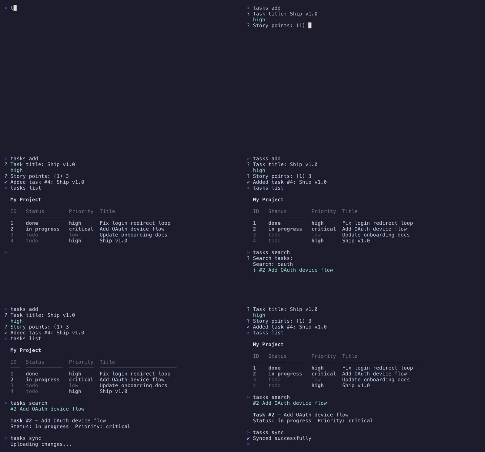
The CLI/TUI hybrid
Prompts and progress render on zcli.ui — a terminal-native layout engine — and it's yours to use directly. Stream lines into scrollback while a live region — a full layout, from one line up to the whole viewport — repaints in place just above them: the shape of modern agent-style CLIs.
A full-screen TUI takes the terminal over; a plain CLI can't paint. The hybrid is the third shape — the one Claude Code, modern installers, and deploy tools use. zcli's engine gives you both halves at once:
- A static stream flows upward into scrollback, one line at a time, exactly like normal output — copy-pasteable, greppable, permanent.
- A live region repaints in place just above the scrollback — anything from a one-line spinner to a full-viewport layout. It's positioned above committed output, not a fixed strip, and shares the screen rather than taking it over, so your scrollback survives.
- Immediate mode means a component is just a function returning a node. You rebuild the tree every frame from your own state; the engine diffs it and sends only the cells that changed.
The frame model
The live region is rebuilt from scratch every frame: the node tree is allocated into a per-frame arena, measured (constraints down, sizes up), painted onto a cell surface, and diffed against the previous surface. An unchanged frame writes zero bytes; a ticking spinner repaints one cell, not the screen.
Two verbs drive it. emit writes a static line that scrolls up and away; frame replaces the live region with a new node tree. emit is the only way to write while a region is up — it erases the region, prints the line into scrollback, and repaints the region below it.
<Static> and dynamic render). When you do want to take the terminal over — a top-style dashboard, an interactive form — the same node tree, layout, and diff run in full-screen mode: alt-screen, raw input, an event loop, and nothing left behind on exit. Same vocabulary, different frame.// State lives in your structs; the frame is a pure function of it. fn statusLine(a: std.mem.Allocator, s: *const State) !ui.Node { return ui.row(a, .{ .gap = 1 }, &.{ ui.widgets.spinner(.{}, s.tick), // animation = your tick ui.text(.{ .bold = true }, s.message), ui.spacer(), // push the rest to the right edge ui.text(.{ .dim = true }, s.elapsed), }); }
Nodes & sizing
The whole vocabulary is four node kinds and three sizing words — small enough to hold in your head, expressive enough for a bordered, multi-column status frame.
| Node | What it is |
|---|---|
| box | the only container — row, column, and stack are boxes with a direction (stack overlaps its children into z-layers); carries gap, padding, and an optional border |
| text | a styled string; ui.textOpts chooses wrap / truncate / clip and a fixed width |
| spacer | flexible empty space; put one before a node to right-align it, one on each side to center |
| custom | the escape hatch — a leaf that draws its own cells (this is how the progress bar is built) |
Every dimension is one of three words. fit shrinks to content, len(n) pins an exact column count, and fill(weight) shares leftover space by weight — so percentages are fill weights and right-alignment is a spacer, not special-cased geometry.
.wrap mode word-wraps and drops break spaces. Labels with significant whitespace — padded numbers, aligned columns — want .clip or .truncate via ui.textOpts.Everything else is composition. center and positioned place a child with spacer scaffolding; panel is a box whose border and fill come from the theme; viewport scrolls content taller than its window; probe and anchored float a popup at a widget's rendered position. None of them is a new node kind — they're helpers built from the four above, so the engine core stays four kinds and three words.
The App
In a command, context.ui(.{}) returns a zcli.ui.App pre-wired to the command's stdout, allocator, theme capability, and TTY detection. The App owns everything stateful — the frame arena (app.arena(), reset when frame() returns), the live region's rows, the double-buffered surfaces, and the cursor (hidden while a region is up, parked at its top-left between calls, restored on deinit).
var app = try context.ui(.{}); defer app.deinit(); // restores the terminal; the final frame persists in scrollback try app.emit("compiled {s}", .{name}); // static -> scrollback try app.frame(try statusLine(app.arena(), &state)); // live -> diffed repaint
Builders copy their child slices into the arena, so component functions compose freely — no dangling-temporary hazards from returning a node built over a stack array. Styles on the nodes are theme.Style values, and the diff renderer emits them capability-aware, from NO_COLOR through true color.
Progress widgets
ui.widgets is the progress vocabulary as component functions: a spinner is a text node, a bar is one custom leaf, a multi-bar is a column of rows. No widget owns a repaint loop or hidden state — animation is your tick, progress is your fraction, the frame diff does the rest. Styling flows through the theme's progress tokens, the same ones the progress package reads. (The interactive widgets — text fields, selects, checkboxes, buttons — live in the same namespace and are covered under full-screen.)
const a = app.arena(); try app.frame(try ui.column(a, .{ .border = .rounded, .padding = .symmetric(1, 0) }, &.{ try ui.row(a, .{ .gap = 1 }, &.{ ui.widgets.spinner(.{}, state.tick), ui.text(.{ .bold = true }, "Reading dependencies"), ui.spacer(), ui.text(.{ .dim = true }, state.elapsed), }), try ui.widgets.multiBar(a, .{}, &.{ .{ .label = "src/parser.zig", .fraction = 0.6 }, .{ .label = "src/formatter.zig", .fraction = 0.9 }, }), }));
Resize & piping
The live region re-measures against the terminal on every frame, so it re-lays-out on resize for free; its height clamps to the viewport and clips from the bottom. Scrollback is the terminal's authority — but the engine retains the source text of the visible static tail and, on a width change, synchronously rewraps it so the seam between the reflowed tail and the live frame stays clean.
- Live region — full relayout against the new width, every frame.
- Visible static tail — retained in source form and repainted to rewrap with the new width.
- Scrollback above the fold — left to the terminal; reflow there is the terminal's job, not the app's.
When stdout is not a TTY — a pipe, a file, a CI log — there is no live region to repaint: emit lines print as normal, and a frame degrades to the plain lines it would draw. The same code path produces an interactive frame and a clean log.
Full-screen mode
The hybrid shares the terminal. Sometimes you want the whole thing — a top-style dashboard, a wizard, a full-screen form. That's the engine's second mode: context.uiFullScreen(.{}) (or App.initFullScreen standalone) switches to the alternate screen and raw input, and the same node trees, layout, and diff run against the full viewport. On exit the shell's screen and scrollback come back exactly as they were — the final frame does not persist. That's the difference from hybrid, where the last frame stays in scrollback.
Instead of you calling emit/frame by hand, full-screen apps hand the loop to app.run. You supply two pure-ish functions and it owns the rest:
view(arena, state)— builds the whole screen as a node tree, exactly like a hybrid frame. Treatstateas read-only here.update(state, event)— mutatesstatefor a key, resize, mouse, focus, or paste, and returns.keepor.quit. Anullevent is the periodic tick.
// Required for full-screen: restore the terminal on a panic before the // trace prints. initFullScreen won't compile without it. pub const panic = zcli.ui.panic; fn view(a: std.mem.Allocator, s: *State) !ui.Node { // ...build the whole screen from state (read-only here), like any frame } fn update(s: *State, ev: ?ui.Event) !ui.Flow { const e = ev orelse { s.advance(); return .keep; }; // null = the tick switch (e) { .key => |k| switch (k) { .char => |c| if (c == 'q') return .quit, .up => s.move(-1), .down => s.move(1), else => {}, }, else => {}, // .resize/.mouse/.focus/.paste — enable what you need } return .keep; } var app = try context.uiFullScreen(.{ .mouse = true }); defer app.deinit(); // leaves the alt-screen — nothing persists try app.run(context.io, &state, 250, view, update, null); // 250ms tick
tick_ms and run delivers a null event on a schedule — a clock for animating data. It's scheduled against a deadline, so a burst of keystrokes shrinks the next wait instead of resetting it: input can't starve the refresh. Pass null for a form or menu that should only wake on input. The final argument, after_frame, is an optional post-paint hook — its home use is placing the hardware cursor, below.Events are opt-in past keys and resize: set .mouse, .focus, or .paste in the options to receive those. emit is a compile-time error in full-screen — there's no scrollback stream to write to; everything is the frame.
Focusable widgets
On top of the layout engine sits a kit of interactive widgets — TextInput, TextArea, Select, Table, Tabs, Checkbox, Button — in the same ui.widgets namespace. Each is a plain struct you keep in your own state: immediate mode all the way down, no retained widget tree, no framework-owned event bus. A widget gives you two methods:
view(arena, opts)— returns the widget's node for this frame; pass.focusedso it draws its caret or highlight.handle(key)— returns whether it consumed the key. That one bool is the entire routing model.
Give the focused widget first crack at each key; an unconsumed key (Tab, Enter, Esc) is form-level navigation. Focus is yours to hold — an enum — and focusNext/focusPrev cycle it with wrap-around. That's the whole contract; there's no form object.
const Field = enum { user, role, submit }; fn update(s: *State, ev: ?ui.Event) !ui.Flow { const key = switch (ev orelse return .keep) { .key => |k| k, else => return .keep }; // The focused widget gets first crack; handle() reports if it consumed the key. switch (s.focus) { .user => if (s.user.handle(key)) return .keep, .role => if (s.role.handle(key, roles.len, 6)) return .keep, .submit => if (s.submit.handle(key)) return .quit, // Enter/Space fires it } // Unconsumed → navigation. switch (key) { .tab => s.focus = ui.widgets.focusNext(Field, s.focus), .back_tab => s.focus = ui.widgets.focusPrev(Field, s.focus), .escape => return .quit, else => {}, } return .keep; }
Select takes its options each frame (immediate mode) and a visible-row budget, and can run in .wrap mode for options that span multiple lines. TextInput carries a caller-owned buffer and can .mask its content for passwords; TextArea is its multi-line sibling — soft wrap at the granted width, visual-row arrows, Enter inserting a newline, and vertical scroll to keep the caret in view. Table is a read-only data grid: Dim-sized columns the layout engine distributes, a themed header, a selectable/scrolling body with PgUp/PgDn paging and cell truncation. Tabs is a stateless tab-bar row (the chrome only; you own the content panes) with ←/→ and number-key selection. A Select or Table — and a viewport — can opt into a proportional scrollbar in the right gutter (off by default, so content width stays stable).
Manual switch (focus) dispatch scales badly past a dozen widgets. FocusRing(State) derives the ring from your state's widget fields at comptime — any field whose type has a handle method — and gives you a reified Focus enum, wrapping next/prev, and a dispatch(state, focus, key, extras) that routes the key to the focused widget. It's sugar over the switch above — no framework loop, no registry, fully bypassable.
cursor_out during render; the after_frame hook then places the real terminal cursor there with app.cursorAt(...). The blinking block lands exactly where typing goes — the layout tree tells you the position, so you never track it by hand.Overlays & popups
A stack box overlaps its children into layers, painted back to front. A layer with no background is transparent — the layers beneath show through its gaps — and a layer with a background is opaque. That single rule is the whole overlay system: a modal is an opaque panel composited over the base screen, with no absolute cursor addressing anywhere. It's just cells painted on top before the frame diff runs.
return ui.stack(a, .{}, &.{ base, // layer 0: the whole screen try ui.center(a, try ui.panel(a, .{ .padding = .symmetric(2, 1) }, &.{ ui.text(.{ .bold = true }, "Keys"), ui.text(.{}, "↑ / ↓ select"), ui.text(.{}, "? close"), })), // layer 1: an opaque, themed modal, centered });
Two more helpers build on the same idea. A viewport is a scrolling window onto content taller than the space it's granted — a log pane, a long list — with the scroll offset held in your own state, and an opt-in scrollbar that paints a proportional thumb in a reserved right column. And probe reports where a node actually rendered, which anchored then uses to pin a popup to it: a dropdown that opens under a button, flips above when it would run off the bottom, and clamps left when it would run off the right — smart placement as pure composition, no new primitive.
ui.panel's border and fill, and any bordered box's border color, derive from your app's zcli_theme surface tokens — so a modal or dropdown needs no style mentions to look right, and one theme change reskins every overlay at once. See theming → surface chrome.Prompts vs widgets
zcli has two ways to ask the user something, and they solve different problems. The prompts package asks a question; the full-screen widgets above build a screen. Reach for the right one:
| prompts | ui widgets | |
|---|---|---|
| shape | one-shot Q&A — const name = try p.text(.{ ... }) blocks, returns a value, moves on | persistent widgets you embed in an App you drive frame by frame |
| loop | self-contained — the prompt runs its own read loop internally | you own the view → update loop (usually via app.run) |
| focus & layout | one field at a time, on its own line | many fields on screen at once, caller-owned focus, full layout |
| non-TTY | falls back to line-based input automatically (pipes, CI) | full-screen only — needs a real terminal |
| reach for it when | a wizard, a scaffold, a few sequential questions | a live form, a dashboard, a pager — anything that owns the screen |
In one line: prompts are a question; widgets are a screen. If you want to ask a few things and print a result, use prompts — they're shorter and degrade gracefully off a TTY. If you want a persistent, laid-out, keyboard-driven surface, build a full-screen App from the focusable widgets.
Works in CI
The same code that draws an interactive UI at a terminal writes clean, greppable logs when it runs headless. There's no --no-interactive flag to remember and no branch to write in your command: zcli checks whether the stream is a TTY (terminal.isStdinTty for prompts, terminal.isStdoutTty for the App — both wired for you by context.prompts() and context.ui()) and picks the right shape. Pipe the command, redirect it to a file, or run it under CI and it degrades on its own.
| at a terminal | piped / redirected / CI | |
|---|---|---|
| prompts | raw-mode, one repainting line per question — arrows, live caret, highlight | line input: text reads a line, confirm a y/n, select prints a numbered list and reads a number. Same return type, same value. |
| App (hybrid) | static emit lines flow into scrollback while the live region repaints above them | frame becomes a no-op and the live region vanishes; emit prints its line plain — no escapes, no cursor moves, no retention. Your log is exactly the emitted lines, in order. |
| App (full-screen) | takes the alternate screen, raw input, an event loop | refuses — initFullScreen returns error.NotATerminal rather than spraying escapes at a file. A TUI into a pipe is meaningless; use the hybrid App or prompts for anything that must also run headless. |
A select at a terminal is an arrow-driven, highlighted list; piped, it's a numbered list that reads a line. Nothing in the calling code changes — the value comes back the same either way.
? Deploy to: ❯ staging ← ↑/↓, Enter production
? Deploy to: 1) staging 2) production > 1
The hybrid App tells the same story. A deploy emits a line at each milestone and repaints a progress gauge between them; off a TTY the gauge simply isn't drawn, and the milestones remain as a plain, ordered log.
✓ built api // emitted → scrollback ⠹ deploying ━━━━━╌╌╌ 3/5 // live region, repaints in place
✓ built api ✓ deployed api
Standalone use
Like every zcli package, ui works without the framework. Outside a command there's no context, so construct the App yourself — it owns heap state (surfaces, retained scrollback), so it takes an explicit init/deinit rather than the value-bundle shape of the stateless packages:
const ui = @import("ui"); var app = try ui.App.init(gpa, writer, .{ .capability = .ansi_256 }); defer app.deinit(); try app.emit("✓ built {s}", .{name}); try app.frame(try statusLine(app.arena(), &state));
Try it
Five runnable examples live in the ui package — all want a real terminal. Resize the window while the hybrid ones run and watch the live frame re-lay-out as the visible static tail rewraps with it; press ? in the full-screen demo, Tab through the form.
zig build run-demo # hybrid: deploy-style task frame — spinner, task list, gauges zig build run-hybrid # hybrid: the Claude-Code shape — streaming prose + a live multi-bar zig build run-fullscreen # full-screen: a top-style table, scrolling viewport, help overlay zig build run-form # full-screen: a focusable form — text fields, select, checkbox, button zig build run-popup # full-screen: anchored dropdowns that flip and clamp on screen